
An event rental operator opens their analytics dashboard on Monday morning and sees hundreds of weekend visitors, yet the inbox contains zero new inquiries. The immediate reaction is to blame the marketing spend or the search rankings. But “the site needs more traffic” is usually the wrong diagnosis. Four different structural elements break the conversion path before a prospective client ever reaches the contact page, and they each require a distinct fix.
What a high-converting photobooth website actually does
When you build or evaluate a photobooth website, the goal is not merely to display hardware or list your services. The objective is to intercept high-intent buyers, prove your operational reliability, and force a qualification check before they consume your administrative time. A site that operates purely as a digital flyer leaves money on the table because it forces the user to work out the logistics themselves. This guide breaks down exactly how to structure an event rental platform that filters out poor fits and accelerates bookings from your ideal clients across corporate events, private parties, and weddings.
Quick Summary
A highly effective event rental site operates as a qualification engine rather than a passive brochure. It filters out poor fits while accelerating serious inquiries by surfacing availability, service boundaries, and clear trust signals early in the journey.
- Separate your offerings into dedicated landing pages to capture specific search intent.
- Embed public liability and safety compliance details directly at the point of inquiry.
- Structure contact forms to gather logistical constraints like venue and event date immediately.
- Design entirely for mobile users, prioritising fast load times and thumb-friendly navigation.
Table of Contents
- What a high-converting photobooth website actually does
- 1. Mapping the booking journey
- Why the discovery phase fails
- The cost of the brochure trap
- 2. Structuring your service pages
- Where lumping services costs you bookings
- Technical specifications prevent on-the-day failures
- 3. Building trust through operational proof
- Why compliance dictates the booking
- Moving past generic praise
- 4. Streamlining the inquiry form
- Blank text boxes invite endless administration
- Extracting logistics without overwhelming the user
- 5. Optimising for mobile performance
- Desktop designs fail during venue walk-throughs
- Heavy files break mobile functionality
- Common Pitfalls & Troubleshooting
- FAQ
- Recommended Reads
1. Mapping the booking journey
Why the discovery phase fails
The booking journey consists of three rigid phases: discovery, verification, and logistical alignment. When visitors land on your site, they need to answer three questions within seconds. Do you offer the specific service they are looking for? Do you cover their geographical region – for instance, do you travel across Aberdeenshire, Moray, and the Highlands? Does your presentation match the aesthetic standard of their event?
If the website fails to answer these questions immediately, the user will leave. Visitors do not search your site to find reasons to hire you; they search for reasons to disqualify you so they can move on to the next tab in their browser.
The cost of the brochure trap
The most common mistake operators make at this stage is falling into the ‘brochure’ trap. This happens when a business owner fills the homepage with dense paragraphs about their personal passion for the entertainment industry or the long history of their company. Clients are attempting to plan an event. They are looking for a rapid solution to a logistical problem, not a biography. By forcing them to read through text that does not address their immediate needs (availability, location, and service type), you introduce friction that directly lowers your conversion rate.
2. Structuring your service pages
Where lumping services costs you bookings
Intent separation is a critical mechanic of website conversion. A corporate client searching for custom monogram projection and a couple seeking a mobile disco have entirely different requirements. Lumping all of your offerings onto a single “Services” mega-page forces users to sift through irrelevant information to find the single paragraph that applies to them.
Practical rule: Never make a client scroll past a service they do not want in order to read about the one they do.
Instead, create dedicated landing pages for each discrete offering. A page explaining your audio guestbook should sit entirely separate from the page detailing confetti cannons. This structure not only improves user experience but also allows search engines to index specific pages for specific queries, capturing highly targeted local traffic.
Technical specifications prevent on-the-day failures
On each dedicated service page, you must list the exact technical specifications of the equipment. State the physical footprint required, the power supply needs, and the necessary setup duration. Venues routinely block equipment on the day of an event because the operator failed to communicate that their setup requires a three-metre clearance or a plug socket within two metres. By placing this information front and centre on the website, you answer the venue manager’s objections before they are even raised, establishing your business as operationally mature.
3. Building trust through operational proof
Why compliance dictates the booking
Anyone can write that they are a professional, but event planners and venue coordinators look for operational proof. They act as the gatekeepers for premium bookings. If a client wants to hire you but the venue rejects you due to a lack of documented compliance, the booking falls through and your marketing spend is wasted.
The mechanics of operational trust rely on displaying your credentials where decisions are made. State clearly that your equipment is fully PAT-certified and that you carry £10m Public Liability Insurance. Do not hide these details on an obscure ‘About Us’ page; place them near your pricing structures and contact forms. When venue coordinators see these credentials upfront, they are far more likely to recommend your services to future clients.
Moving past generic praise
A written quote saying “Great music” does very little to convince a cautious buyer. A detailed account of how smoothly the setup went in a specific, known venue holds immense weight. A structured approach to gathering and displaying client feedback ensures that prospective buyers see evidence of your reliability in challenging environments. Include the name of the venue alongside the review, which proves to local planners that you are familiar with the access routes and acoustic challenges of the spaces they manage.
4. Streamlining the inquiry form
Blank text boxes invite endless administration
The contact form is the operational bottleneck of your entire website. If you provide a generic form asking only for a name, an email address, and a blank message box, you invite vague inquiries. A message that simply reads “How much for a party?” is a failure of form design. It forces you into an administrative back-and-forth just to establish the basic logistics required to issue an accurate quote.
Extracting logistics without overwhelming the user
Calibrate the form to extract the necessary logistical constraints immediately. Ask for the specific event date using a calendar dropdown. This allows you to check your availability before writing a single word in response. Ask for the venue name and location, which determines your travel time and access difficulties. Ask the user to select the specific service they require from a predetermined list.
The mistake here is swinging too far in the opposite direction and demanding granular details – such as exact schedules, guest counts, or rigid budget caps – before the client has even spoken to you. Keep it to the absolute minimum required to check availability and calculate a baseline cost. If you find yourself repeatedly answering the same logistical queries over email, an alternative is dedicating a section of the site to documenting answers to frequent client questions, filtering out objections before the form is ever submitted.
5. Optimising for mobile performance
Desktop designs fail during venue walk-throughs
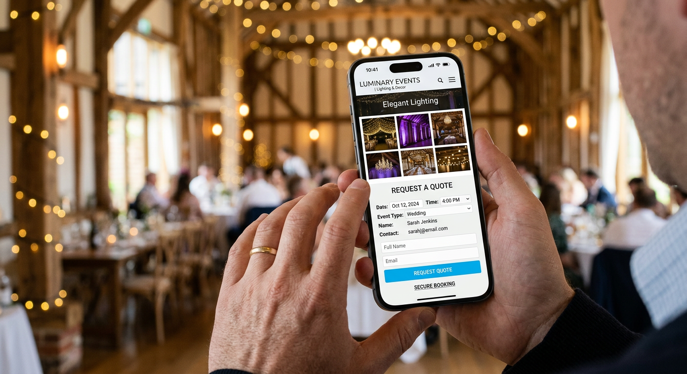
Event planning rarely happens at a desktop computer. Clients coordinate their events on smartphones during their commute, or crucially, while walking around a venue. They will stand in a draughty barn, pull out their phone, and try to load your site to see if your lighting setup will fit in the corner they are currently looking at.
If your website relies on a desktop-first design, it will fail in this exact scenario. Large image files, such as uncompressed gallery photos, take far too long to load over a weak mobile connection. If the page takes longer than three seconds to render, the user will lock their phone and forget about your business.
Heavy files break mobile functionality
The mechanics of a mobile-optimised site involve using modern, compressed image formats like WebP, implementing lazy loading so that off-screen images do not delay the initial page render, and ensuring all interactive elements are large enough to be easily tapped. Standard mobile accessibility requires thumb-sized touch targets for all buttons and form fields.
The most common failure mode here is a contact form that breaks on a narrow screen, forcing the user to scroll horizontally just to hit the submit button. Always test the inquiry path on a mobile device to ensure the layout remains entirely functional under poor network conditions.
Common Pitfalls & Troubleshooting
When a website fails to generate bookings, operators often jump to the wrong conclusions. Here is how to diagnose the actual failures that break the conversion path.
High traffic but zero inquiries
The symptom: Your analytics dashboard shows hundreds of visitors, but your inbox remains empty. The immediate assumption is that the traffic is of poor quality or driven by bots.
The fix: This is most often the real cause: the site lacks a clear, immediate value proposition above the fold. Ensure that the moment the page loads, without scrolling, the user can read exactly what you offer, where you operate, and what they need to do next. Move the primary call to action out of the navigation menu and into the centre of the screen.
Constant inquiries for unavailable dates
The symptom: You spend a significant portion of your week replying to emails only to decline the work because the event is outside your service area or on a fully booked date.
The fix: The website fails to communicate geographical boundaries early in the user journey, or the contact form does not force the user to state their event date upfront. Explicitly name your primary service regions prominently on the home page and make the event date a mandatory, formatted field on the initial inquiry form.
Price shoppers bouncing immediately
The symptom: You receive inquiries, but the moment you send a quote, the prospect goes silent. It looks as though your pricing is too high for the market.
The fix: The website does not anchor the value of the service before the prospect initiates contact. Hiding prices entirely means only those hunting for the cheapest option bother to reach out. Publish a baseline or “starting from” price on the service pages. This anchors expectations and filters out budgets that are entirely mismatched to your offering, saving both parties administrative time.
FAQ
Should event rental websites display full pricing?
Publishing a rigid, comprehensive price list can be restrictive because every event has different logistical requirements, travel times, and setup complexities. However, hiding pricing entirely frustrates serious buyers. The most effective approach is to display a “starting from” price. This immediately filters out prospects with completely incompatible budgets while leaving you the flexibility to quote accurately based on the specific venue and date.
Do I need separate websites for different entertainment services?
No. Managing multiple domains splits your administrative focus and dilutes your search engine authority. A better structural approach is to use a single, strong domain and create entirely distinct, dedicated service pages for each offering. This allows you to target specific search intent without maintaining entirely separate digital infrastructures.
How many images should go into a service gallery?
A gallery should contain enough images to prove consistency without overwhelming the user’s mobile data connection. Aim for a curated selection of 12 to 15 high-quality, compressed photographs that show people actively engaging with the service, rather than just pictures of hardware sitting in an empty room. This provides the aesthetic confirmation clients seek.
Where is the best place to state venue and technical requirements?
Do not bury technical specifications on a general terms and conditions page. Place footprint dimensions, power requirements, and setup times directly on the specific service landing page. This positions you as an experienced professional who understands the operational realities of live events and helps venues clear your equipment for use without friction.


Pingback: How to Build a High-Converting Photobooth Website in 2026 – JP the DJ